
Many designers and UX researchers start their adventure with Nielsen’s Heuristics. These are 10 good practices in designing the best possible user experience. The creator of these heuristics is Jakob Nielsen, one of the fathers of today’s UX. Most of how we understand User Experience today is based on these 10 design practices. Have you ever heard of Hoober’s Heuristics?
There is no shortage of prominent researchers in the UX industry, and one of them is actually Steven Hoober, who created design heuristics for touch devices. It all started with a 2013 article in UX Matters about how people use their touch phones. It came out that the thumb, because of its physiology, reaches only to some regions of the screen and it is hard to use it to click something e.g. in the upper left corner of the screen (right-handed people). The picture below shows the result of the author’s work. Probably most of you have already come across this drawing.
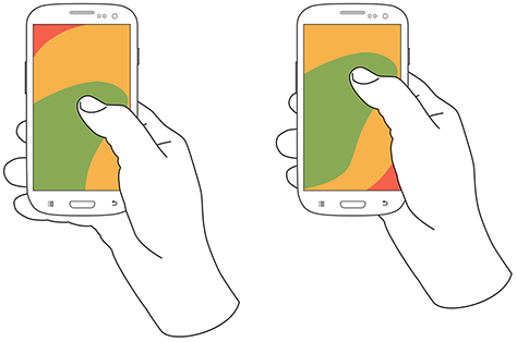
Source: https://www.uxmatters.com/mt/archives/2013/02/how-do-users-really-hold-mobile-devices.php
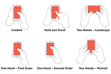
However, it turns out that this research wasn’t entirely correct, and the author himself admitted that he only now understood how people use their smartphones and released an update to his research in 2017. Hoober spent years examining the ways people touch touchscreens and created a three-part article describing just about everything – the design and technology of touchscreens since their inception, the physiology of the thumb, the different ways people hold not only smartphones but also tablets, heatmaps of scrolling, and a ton of other interesting things. In this article, however, we will focus not on the entire study but on the results that came out of it, namely Hoober’s 10 Heuristics.
For the sake of clarification, so as not to leave you with a wrong picture from previous studies, I will present below the actual ways of holding touch devices and we will go straight to what is most interesting. We don’t realize it on a daily basis, but depending on what we are doing, we hold the smartphone in different ways.
Hoober’s 10 Heuristics:
- the diversity of devices is the diversity of people
- Design for every user and every type and size of phone.
- Design for the different ways people work with their devices, not just one way.
- Put your biases aside. Don’t assume that everyone has your phone or uses it the same way you do.
- People touch the center of the screen
- Users prefer to touch the center of the screen and will do so every time you give them that choice.
- Place key actions in the middle half to two-thirds of the screen. Then place options and buttons for additional screens at the top and bottom of the screen.
- People look at the center of the screen
- Make sure the key content is in the middle of the page – it could be an item to click on or just look at.
- When a page of content ends, give people the option to scroll to the center of the screen – this can be done by leaving a larger margin below that content.
- Fingers get in the way
- Make sure users’ fingers don’t obstruct the content so they can see what they’re clicking on.
- Make sure the selectable items are large enough to clearly see that the user clicked on them. Try to place features or any content that changes state so users can see the result of their click right away. Distribute features in a way that invites users to perform actions that you think are important.
- Make sure there is plenty of free space in your content, as well as reasonable margins, so users can be sure to scroll or use gestures in an area where there are no buttons or other elements that can be clicked accidentally.
- People use different devices in different ways
- Support all types of devices – especially when creating responsive websites or apps for tablets and phones. There are many different devices because people’s needs are different and you should respect them.
- If you can, collect data about how your users work in their real-world environment.
- For optimal readability, adjust the sizes of fonts, icons, text boxes, checkboxes, and buttons to match the typical distance of the screen from the user’s eyes for a particular class of device – for example, we hold a tablet farther from our eyes than a phone, so we can use larger fonts than on a phone.
- Touch is imprecise
- Remember that real users work with touch interfaces in the real world.
- Make the click area as large as possible, preferably whole rows, fields and buttons, not just icons or words inside them.
- Don’t tailor your design to the touch interface. Make your designs tactile-focused right from the grid and template level by providing enough space and the right kind of interactivity.
- One, two, three for better mobile design
- Separate clickable elements so that something the user didn’t want is not accidentally turned on.
- Touch accuracy varies depending on the area of the screen. Touching the sides of the screen is less accurate than touching the center, so for lists that have options on the sides, such as delete or select (selecting a row from the list), make sure the height of the row is large enough (about 9 to 12mm) that the user can easily click on it.
- When you place controls at the top or bottom of the screen, give them as little space as possible.
- Remember to place buttons that either trigger dangerous and irreversible actions or display annoying and difficult to exit items away from other actions or give the ability to easily undo these actions. This includes, for example, placing the “send” button far away from the text editing buttons so the user doesn’t accidentally send the message they are editing.
- People only touch what they see
Visual targets-whether they are text, icons, shapes, or another type of widget-must do the following:
- Attract the user’s eye.
- Be visually presented so that the user understands that they are clickable elements.
- Be legible so that the user understands what actions they will perform.
- Be large and clear enough for the user to click easily and confidently.
- Phones are not flat
- The phone is not flat – depending on the design of the phone or the situation the user is currently in, the user may have difficulty clicking on certain items. Think about the worst cases.
- Plan for different usage contexts and try out your designs in difficult environments to make sure they work well in the real world.
- If you want to place elements right at the edges of the screen or use edge gestures, go ahead. But give them good spacing so they work even with cases and curved screens.
- Working on a human scale
- Get away from the computer and try out your designs on real devices as soon and as often as possible.
- Move away from presenting your designs only in PowerPoint and instead take your phone (or other device, such as a tablet) to a meeting and show it there to get approval.
- To account for under-scaling, poor environments, and users with poor eyesight, always design everything about 20% larger than you would otherwise.
I hope I’ve made you at least a little more familiar with the principles of designing for touch devices. Check out how the websites and apps you’ve been working on look and behave. Maybe they are fine, or maybe they need some improvements from the list above to make them work better and bring better profits.
If you have reached the end, I recommend you read the full study results here: https://www.uxmatters.com/mt/archives/2017/03/design-for-fingers-touch-and-people-part-1.php
And remember that phones are not just flat glass slides that are always held perfectly like in ads – in real life they have different sizes, different users who use them in different situations and in different ways, so let’s make sure that what is displayed on them always works well.
Sources:
https://www.uxmatters.com/mt/archives/2013/02/how-do-users-really-hold-mobile-devices.php
https://www.uxmatters.com/mt/archives/2017/03/design-for-fingers-touch-and-people-part-1.php
https://www.uxmatters.com/mt/archives/2017/05/design-for-fingers-touch-and-people-part-2.php
https://www.uxmatters.com/mt/archives/2017/07/design-for-fingers-touch-and-people-part-3.php
https://pl.wikipedia.org/wiki/Jakob_Nielsen