
The topic of the pandemic and its impact on the way we shop has been discussed many times. Just as often the authors of their reflections have come to similar conclusions, which by the way are supported by numbers. According to McKinsey, e-commerce sales grew by nearly 20% in just the first three months of 2020, accelerating e-commerce trends by the equivalent of 10 years. However, it is very rare to talk about those who, even before the pandemic, fought against digital exclusion and now have to face changes that do not always solve their problems and, in most cases, even exacerbate them. What can be done to make eCommerce content published on major eRetailers (such as Amazon) more accessible? The solution may be something I call Designing with Empathy.
These accelerating eCommerce trends are sure to continue at increased levels even after the crisis passes. The reason, of course, is the rapid increase in one’s dependence on the web for access to almost everything: shopping, delivery, healthcare, education and, of course, work. There are approximately 61 million people with disabilities in the United States, and 135 million in Europe alone. While most people are able to shop online with ease and be able to fulfill their needs, people with disabilities struggle with even the most basic aspects of shopping with eRetailers. It’s not just the fault of the platforms themselves and the lack of disability accommodations, but also the brands’ content itself, which floods listings, product cards and brand stores in myriad ways.
However, there is a second side to this situation. In pandemic times, the computer has become just a part of the job, and the name personal has been given to the phone this time. We work on the computer at our desk and shop on our phone on the sofa. Considering all the numbers and the above facts, it’s hard not to focus on the availability of eCommerce content at eRetailers for mobile devices. And this is where an element called Designing with Empathy should come into play.
Designing with Empathy is a term used to describe a design process where we consider another point of view, need or preference, create a compromise in communication by stepping outside the boundaries of one’s experience or perspective.
Of course, we don’t know what percentage of the people who will use our materials are visually impaired, but just understanding the accessibility of visual elements and adapting them to the needs of this group will be a success and benefit to the entire target audience. How do we do this when designing static e-commerce materials for eRetailers? We need to optimize and test. Mobile Ready Hero Image can be a basic element.
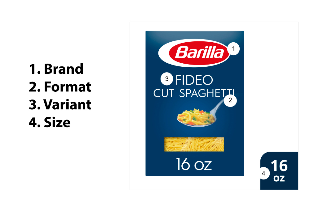
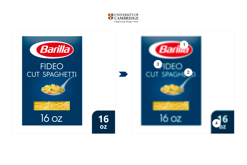
A Mobile Ready Hero Image (MRHI) is a representation of an actual product that may differ from a standard packaging image, but retains most of the key elements of physical packaging, such as design, shape and color, and is therefore recognizable on the digital shelf.
MRHI is a mobile approach to core e-commerce imagery that makes the product more accessible on all screen/device sizes. It allows online shoppers to choose the right product faster because the image contains 4 basic W’s:
- Who is the brand
- What is it
- Which variety
- hoW much
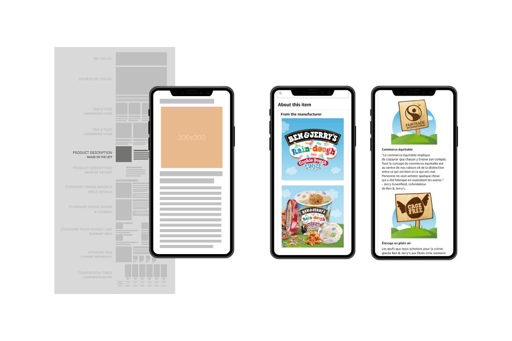
Product Description (Enhanced Content) is also part of the optimization.
Optimizing content within the Product Description is an entirely new “mobile first” approach that calls for optimized solutions for mobile devices using non-responsive resources, on large platforms without dedicated UX and HTML.
So what can we do if the eRetailer environment doesn’t allow us to fully personalize our materials?
First, we need to change our thinking about the “mobile first” approach that was imposed years ago around Responsive Web Design, focusing on both custom desktop and mobile solutions. eRatailers don’t provide any opportunities to personalize content (with UX and HTML involvement). We have to work with non-responsive assets that can only scale up and down.
Secondly, we need to remember the basic values for optimization and accessibility: resizing modules on different devices, sufficient contrast, placing text away from images and on a solid background.
These two optimization elements are only a small part of the treatments that also lead to accessibility. A few years ago, we were able to find a solution for improving product cards on desktop, which also helped to build a solid foundation for optimizing materials for mobile views as well. Mobile Ready Hero Image and optimized product description thus became a natural next step on the way to full accessibility within eRetailers.
None of these solutions would make sense if they weren’t tested. Tests do not require financial outlays, and they are a very important, if not the most important element of the design process. They give us the knowledge to eliminate basic mistakes in the creation of available materials. I will focus only on the basic tests, because the more advanced and often innovative ones that we use could be a separate article.
One of the main tests is the “Clari-Fi” blur, which involves simulating a 16 x 16 mm display image on a mobile device held at arm’s length. All elements (Brand, Format, Variant, Size) for the Mobile Optimized Hero Image must be recognizable when the blur is applied.
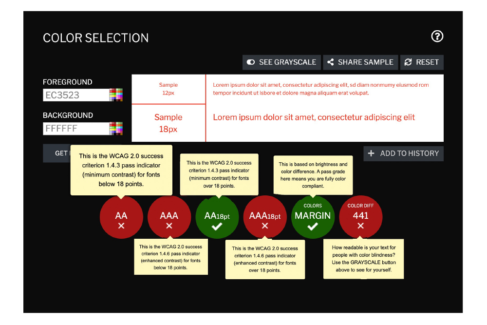
Contrast testing cannot be overlooked. Globally, about 300 million people suffer from color-blindness and 2.2 billion people have vision problems that can hinder their enjoyment of digital materials. Understanding the positive and negative effects of certain color combinations will help reach more people. WCAG (Web Content Accessibility Guidelines) outlines the rules we should follow to make your products more accessible to people with a wide range of visual impairments.
These are, of course, basic treatments to fix the basics. There’s no way to solve the problem by optimizing visuals that are in the not-so-accessible environment of eRetailers anyway. Designing with Empathy, however, can be an important step in creating an accessible digital world and in changing the mindset that somehow it will work. Optimizing materials for mobile is half the battle in creating accessible materials. Not just for those who have been excluded. For everyone.
Sources:
retailtouchpoints.com
business2community.com
ecommerce.inclusivedesigntoolkit.com